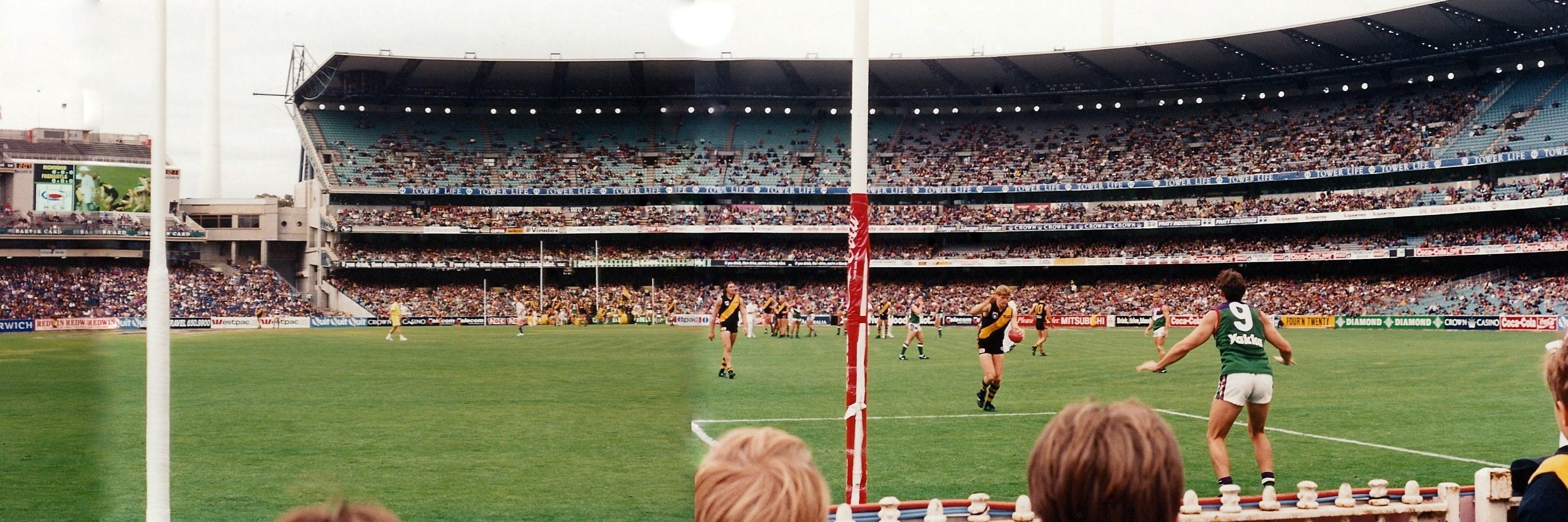
 Round 1, 1995. This is the birth of the Fremantle Dockers, inducted into league footy at the spiritual home of the game, yet thousands of miles from their own home base. It was an inglorious beginning; an honourable 5 point loss in front of a smallish crowd in a scrappy match, as Richmond tried to encounter the foreign beast which was Fremantle’s short kicking possession game, a sign of things to come.
The above pic is actually a few pictures from the day sewn lovingly together by my dad, and we can see Stuart Edwards about to goal with Peter Mann manning the mark.
It will be on this very ground that the Dockers will strive for glory this Saturday, having matured and come a long way from the team which ran out for Fremantle’s first match. And those who are up in arms about the Dockers not wearing purple on Saturday, well it was a predominately green, not purple jumper which the Dockers began life in. Perhaps the umps will be in green to pay homage to Freo’s short past?
Happy grand final everyone

