West Coast and Adelaide are often lumped together. Both teams represent their state’s local leagues, the WAFL and the SANFL, and are considered the ‘big brother’ of their respective cross town rivals, Fremantle and Port Adelaide. Both also enjoyed early success, prising away two flags each from a bitter Victorian landscape during the 1990’s.
Why is it then that I consider Adelaide a bona fide footy club, and the Eagles still as a franchise, a bit plastic? I was only 6 when they entered the competition so I’ve grown up with them, but there’s something not quite right for me.
So what’s in a name?
Let’s start with Adelaide. It is what it is, it represents the town of….Adelaide! The previous incarnation of the Adelaide Football Club disbanded in 1893 and is in no way connected to the current day club, which meant that upon entrance to the AFL in 1991, their was no hesitation in simply calling the club Adelaide.
West Coast on the other hand is to me a vague choice of name to represent a Perth based club. In their defence, the name Perth Football Club was already taken, the Perth Demons being a member of the WAFL. However, the ‘West Coast’ of Australia represents a landmass four to five times larger larger the United Kingdom, and as all landmasses possess a west coast, to me the name is generic and far from inspiring.
Think I’m being harsh? Consider the words of respected footy commentator and proud West Australian Dennis Cometti. He describes the “dumb name” as “American crapola!” The usually affable Cometti continued “It’s a real blight on the competition.”
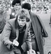
Cometti coaching WAFL side West Perth, who he also played with. Image from- http://www.theage.com.au/ffximage/2005/08/26/cometti.jpg
Part of Cometti’s reasoning is a lack of a geographical focus. “I have struck many people who I have met overseas who follow Australian rules who ask me where West Coast is located. They ask me how far from Melbourne is it.” The Perth Eagles is Cometti’s preferred choice.
While the name ‘Perth’ was out of reach, perhaps something such as ‘Greater Perth’ could have worked. That’s what marketing and branding people are out there for. ‘West Coast’ seems a poor choice.
Nicknames and Monikers
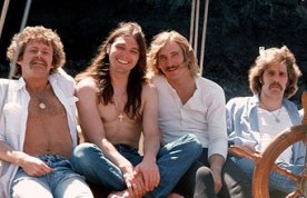
The Eagles. Easy listening pop-rock music, from the West Coast of the USA. That’s right, ‘West Coast Eagles’ conjures up images of harmonic pop melodies, sweetly sung by hairy, good natured ‘boy next door’ types. It hardly sounds befitting of a hard and tough football team, which is what West Coast have been for the majority of their existence.
The Eagles from the US West Coast. Perhaps Eagle Ben Cousins modelled his open shirt look from the bloke on the left? Image from-http://images.paraorkut.com/img/artists/images/t/the_eagles-1137.jpg
But what should a team from Perth have been called? Like the Perth name was taken, so was the obvious W.A football name of Swans; snatched by South Melbourne after an influx of West Australian recruits many years ago. The state team was also known as the ‘Sandgropers,’ a colloquial term for West Australians. However ‘Greater Perth Gropers’ would struggle to secure the sponsorship dollars needed to run a football club. I don’t have the answer, but ‘West Coast’ with ‘Eagles’ is too American.
Compare this with Adelaide’s moniker, the Crows. This is no throw-away nickname, instead it is steeped in more history than most. South Australia’s state football team has been long known as the Croweaters, a unique name which started out as a term of ridicule. It can be traced back to 1851, seven years before the recognised ‘beginnings’ of our national game began fragmenting themselves together.
As the South Australians rushed to the Victorian gold fields they began to run low on food, so out of necessity, “killed, cooked and ate some crows.” Arriving at the gold fields in a “very hard up state” and after relating their experiences, they were soon dubbed the ‘croweaters.’ The name stuck.
So whilst ‘Crow-eaters’ and ‘Crows’ confusingly brings up thoughts of cannibalism, this too adds to their footy club culture, as all the old clubs have the ability to ‘eat their own’ in times of trouble.
The Jumper
We now turn our attention the two teams guernsey designs. This is important to me. If the jumper is right, I can turn a blind eye to other aspects. When West Coast and the Brisbane Bears entered the VFL competition in 1987, they brought with them two jumpers which challenged the definition of a ‘footy jumper.’
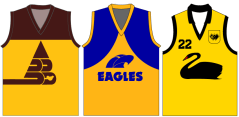 The original 1987 Brisbane and West Coast jumpers, along with the WA state jumper. Upon putting these together I noticed that perhaps a picture of a bird in the middle of the guernsey was possibly a shout out to tradition.
The first thing to notice is that there was far more yellow than had been used in the VFL to that point . But for me this worked, as yellow seemed a colour representative of far warmer climates than the Melbourne competition they were joining. West Australia’s state team had a predominately yellow jumper, and this provided a nice link.
Anthony Costa, whose site http://www.costasportslogos.com/ looks at sporting logos, branding and uniforms amongst other things, also prefers the “gold jumper, which for me is the club’s most distinctive onfield look. There’s a lot of blue and dark sombre colours in the AFL… reckon this jumper would really light things up.”
West Coast reversed the colours in 1988, the colour blue becoming the more dominant, though many shades of blue have since been used. I found and continue to find the Eagles jumper a tad fiddley, with both the writing and the picture being rather non-descript when viewed from any distance past ten metres, though the word Eagles is long gone. The guernsey has never felt settled and is often tinkered with. I am still unclear which is their ‘official’ jumper.
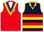
Adelaide on the other hand have ticked ‘all the boxes’ as the clichéd footy saying goes. Their colours, red, blue and yellow are those of their states football team. Their design is simple and striking, like a Geelong jumper on an acid trip.
South Australia’s jumper left, Adelaide jumper right.
A look through Adelaide’s home jumpers from 1991 to today shows the most minor of tinkering, which would indicate that they have got it right. No fancy pictures, words or designs, which incidentally are impossible to see as a player is chasing the pigskin in the distance. Just simple, bold colours and patterns.
To illustrate my point, the past few years have seen Port Adelaide, Fremantle and Footscray all simplify their jumpers, removing all imagery, to near-universal praise. Port Adelaide’s current jumper was even designed by a 7 year old fan. Consider all the money wasted on professional advice from marketing and design companies!
Club Song
This is my final point. As a a musician, I can’t help but see this as integral to the fabric and culture of a club. I’ll kick this section off with a tweet I came across after West Coast’s recent thrilling victory over Hawthorn.
Simple statement. True statement. West Coast’s ‘modern’ rock-pop themesong severely lacks the punch and heart thumping pride found in old fashioned brass band music. It sounds corny, but it’s amazing what can happen when you mix a tuba, trombone and banjo with a barbershop quartet on heat! The rock beat which sits behind West Coast’s song also sucks the number dry of emotion and feeling.
*click* West Coast’s themesong (Warning! Contains mediocre footy song!)
While Adelaide’s song is far from the best in the league, again you get the sense that they have aimed for the type of song which blokes can sing together post-match, a cappella. They have the right idea, I’m just not sure about the execution. But it has the desired effect as the Adelaide players congregate post-victory. I think I can even hear the Coodabeens South Aussie representative Greg Champion’s voice in there!
*click* Adelaide’s themesong (Warning! Contains MIDI instruments)
Final thoughts
When it comes to club image, marketing and all that jargon, the Crows have just kept it simple and rooted in the past. And just think, anything fancy wouldn’t have matched the heads of McDermott, Weideman, Maynard, Rhenn or Riccoutiou!
West Coast on other hand were and are a slick, professional outfit. Business like and clean cut, seemingly an emotionless machine. Much of that could have been due to coach Mick Malthouse’s approach and demeanor at the time. But just think of McKenna, Worsfold, Pyke and co…. they would have looked just as comfortable on the footy field as they would have in business suits.
 Sure, West Coast had the rough heads of Gastev and Ishchenko run around, while the Crows had glamour boy Modra and the clean-cut Tyson Edwards, but these are the exceptions rather than the rule.
Perhaps the ‘American’ West Coast image suits this club? Perhaps it was what the Eagles founders saw as their aim? But I don’t think so. Think of Worsfold’s toughness, the skill of Matera, Dean Kemp and Guy McKenna’s courage, Ashley McIntosh throwing his light frame around with little regard for himself. What of the toughness of the pint-sized Daniel Kerr, the gut-running of Cousins and Judd, the fear Beau Waters instils in opponents. A team renowned for their miserly defence and toughness.
West Coast Eagle fans, you deserve better. Your club’s image does not match the reality of your club, whilst the Crows, love them or hate them, would appear to have done things well.
What’s your take? I would love to hear from Eagles and Crow fans alike!
With a little help from my friends…
-Click here for more of Anthony Costa’s thoughts on the West Coast logo
-All jumper images were found at footyjumper.com. For a comprehensive look at VFL-AFL and state jumpers, this website will not leave you disappointed! http://www.footyjumpers.com/
Cometti’s comments were courtesy of http://www.perthnow.com.au/sport/west-coast-name-is-dumb/story-e6frg1wu-1111113132067
And the Crow-eaters history lesson was found here- http://www.slsa.sa.gov.au/manning/sa/misc/crema.htm#croweaters

