Away jumpers, clash jumpers, alternative jumpers. All clubs have them, some are great, some not so great, and then there are the downright awful. As I recently read through rossvslater‘s blog posts under the category titled ‘AFL Strangest Jumpers‘ I chuckled through gritted teeth at the inadequate, the feeble, and the greedy grabs for cash.
Now I seem to remember hearing once, possibly twice, that it’s best not to criticise unless you yourself have a solution to said criticism. As such, I have spent some alone time with MSPaint (and a little help from the wonderful footy jumpers website) to come up with my very own clash jumpers for every team in the AFL. The only teams I haven’t bothered with are Footscray, Fremantle and Port Adelaide, whom I think have it right. Funnily enough, and this will be a bit of a theme throughout, each of those clubs in the past few years have SIMPLIFIED their jumper designs, removing a clip art bulldog, an anchor and some lightning or something. That’s right, the age old K.I.S.S! (keep it simple spotty!)
I gave myself no particular guidelines, and as it turns out, a few of the designs are rather similar to some of the great ideas shared on this big footy forum page (well worth a squiz!) I guess it’s just a case of ‘great minds and all that.’
Without further ado:
Adelaide Football Club – In my mind, the Adelaide home jumper is by far the strongest of the ‘new’ jumpers to enter the VFL-AFL competition (you can read my expanded thoughts on the topic HERE.) However, their attempts at a clash jumper have been if not disastrous, then incredibly floppy. Here is my idea for a basic, ‘pictures-of-crows’ free design. It removes all but three of the bands off the home jumper. Done, next!

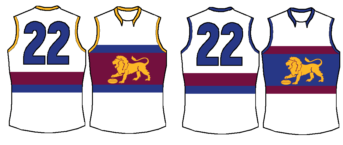
Brisbane Football Club – So much scope for greatness here. I’m not one for having images on jumpers but the Fitzroy Lion (not the three-peat Lion) is the exception to the rule. I think either of these maintain the greatness of the home jumper (they’re ditching the paddlepop next year) whilst making it, well, alternative and clash free!
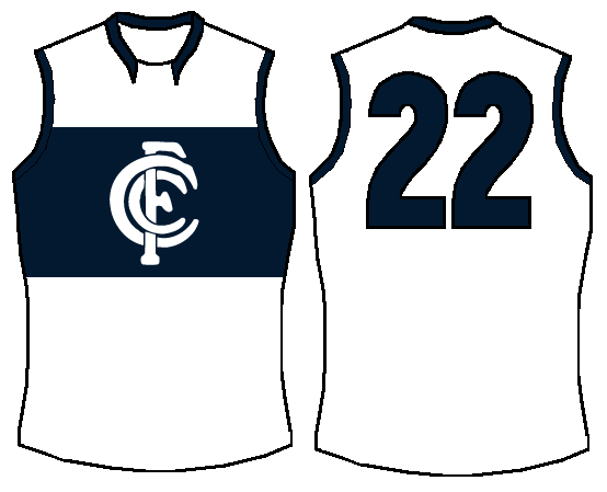
Carlton Football Club – Another great old jumper with many attempts at a clash jumper, which have left me wanting more. Their Sturt inspired jumper last year looked great, but it just wasn’t Carlton. And while I don’t hate their current reverse strip, I prefer to see the CFC monogram white on a navy blue band.
Collingwood Football Club – I found this to be one of the more difficult to get my head around. The stripes are integral, I get that, but to truly get away from the North Melbourne jumper there needs to be more white. Now marketing gurus and designy peeps, that big white space sure looks like it’s crying out for some sort of swooping magpie does it not!? WRONG! Leave it!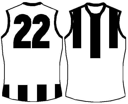
Ed-A few alterations suggested by twit follower, Pie and footy enthusiast, @lucasgarth 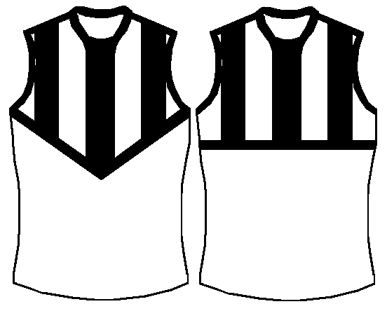
Essendon Football Club – Now if I found the Collingwood jumper difficult, the Essendon one was near impossible. I’m still not sure I love it, but it’s a darn site better than their grey/silver number. The sash is intact, and the EFC logo seemed to add that little thing it was missing, whilst probably being in the way of prime advertising real estate!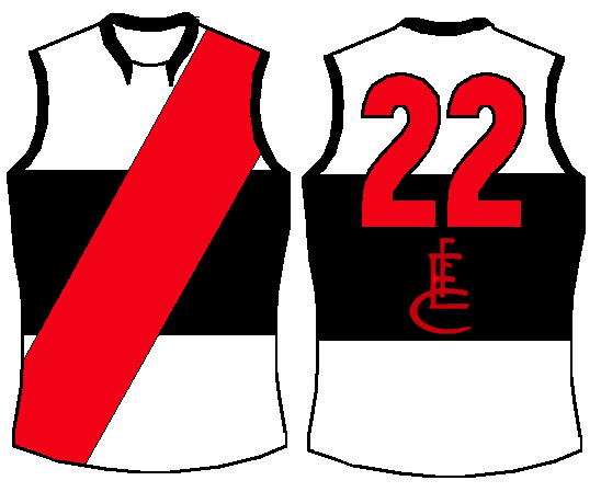
Geelong Football Club – The idea is similar to the Adelaide one, remove some hoops to create some white space (leave it alone!) whilst maintaining a Geelong jumper feel. Not much more to say really.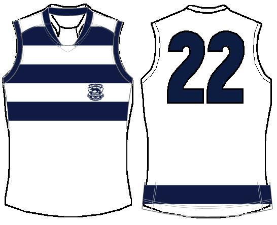
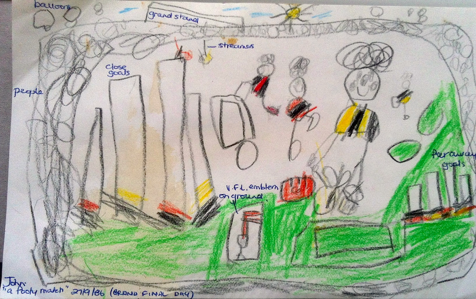
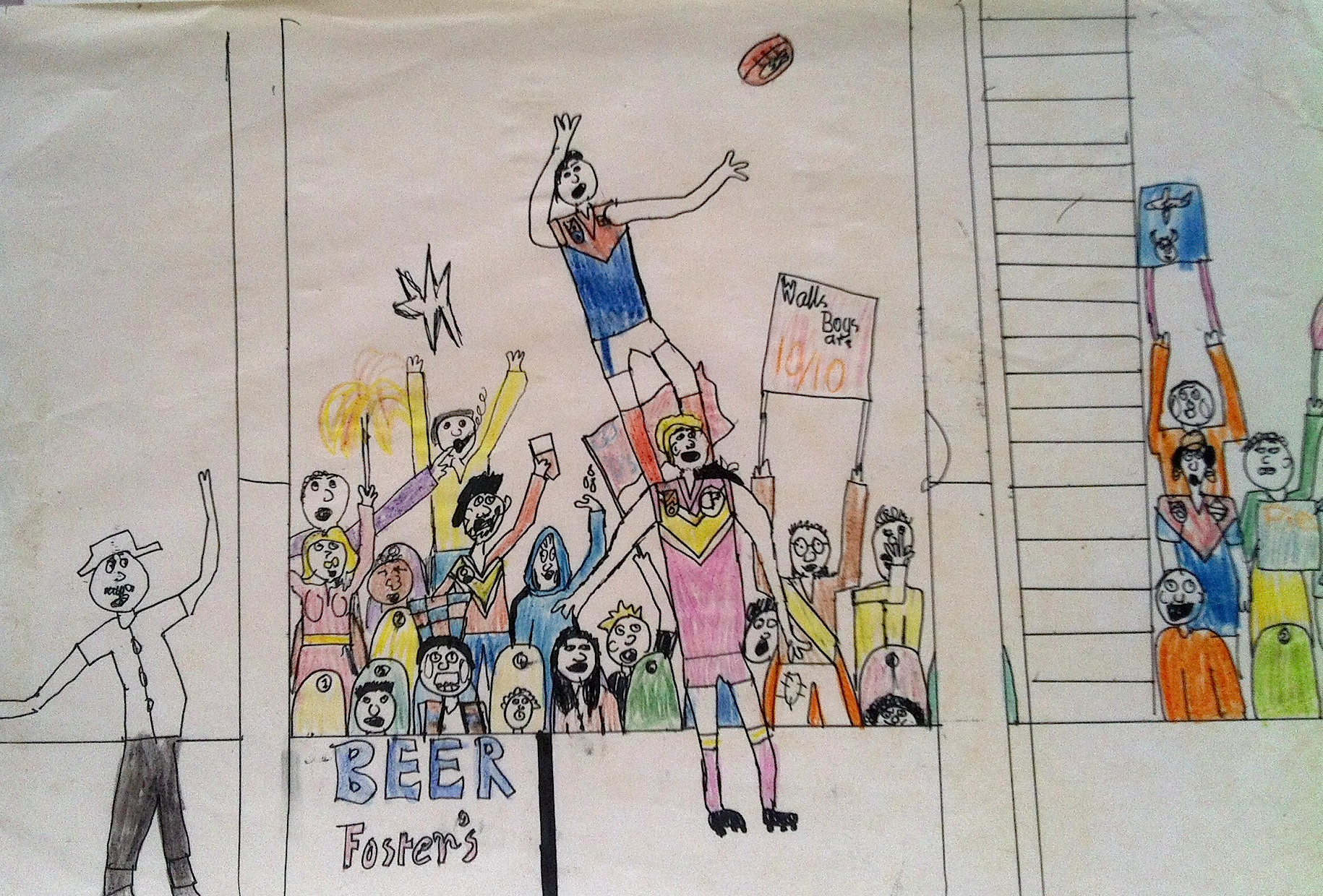
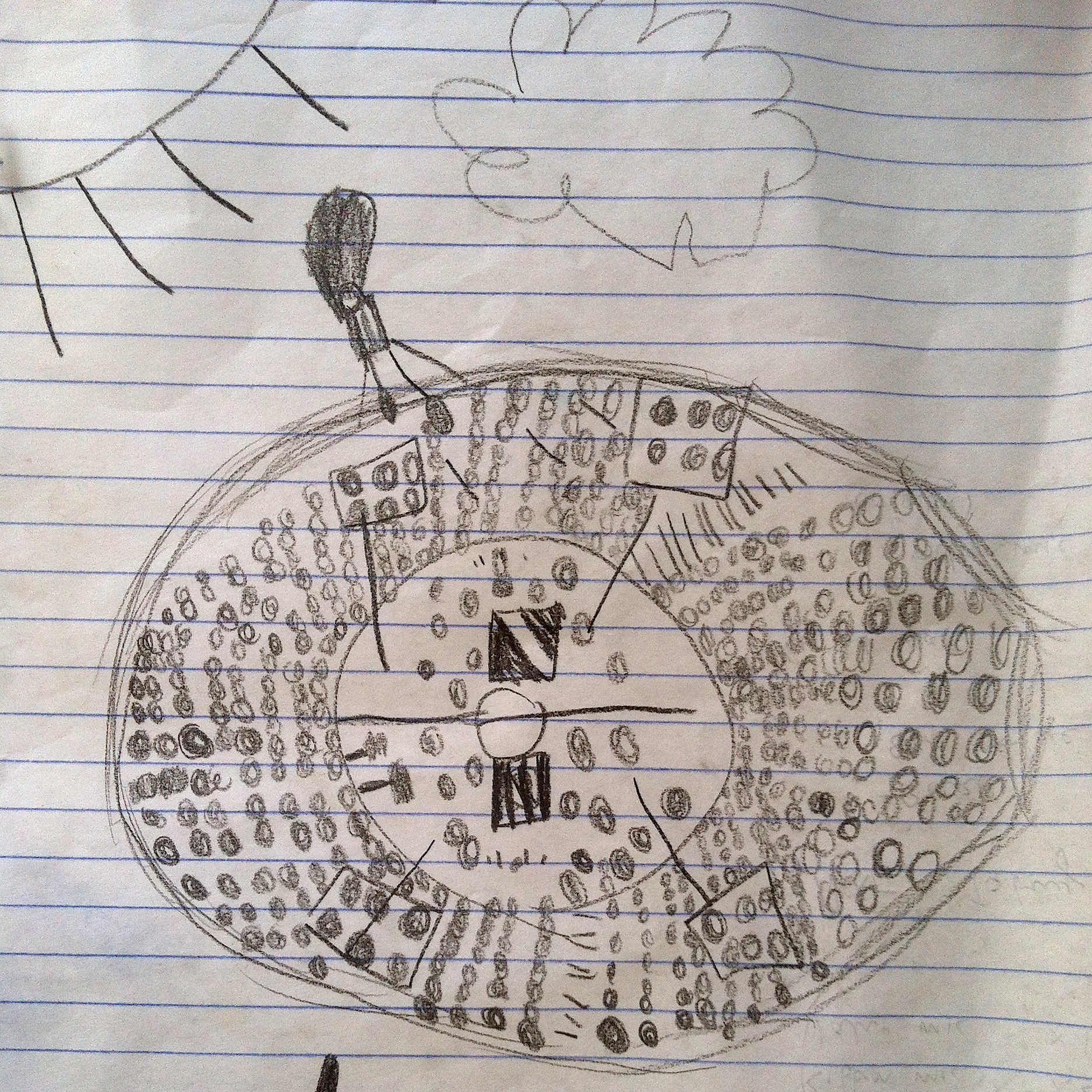
Gold Coast Football Club – Now as the Suns are still wearing their training tops in the AFL, I thought I’d go to the trouble of designing them a home jumper as well as a stab at a bit of a clash jumper. Drawing inspiration from Port Adelaide’s current jumper, designed by a GRADE ONE STUDENT (I kid you not) I have drawn upon my on primary school’s footy jumper (below) for inspiration. I think that the colours yellow and red are fantastic yet brutally under-utilised on the Suns jumper. I appreciate that they went for simplicity, but their GC just doesn’t cut it for me. The away jumper is, I believe, simple yet effective, with the addition of blue trims and numbers because, you know, beach. NEXT!


Greater Western Sydney Football Club (What a bloody mouthfull!) – While it’s a better jumper than the Suns, I think a new home jumper would be better, with accompanying clash version. I didn’t think I’d like to have the snazzy ‘G’ on the jumper but it just looked right. I do like the colour orange on a footy jumper, and the charcoal, even though it sounds wanky, balances it nicely.
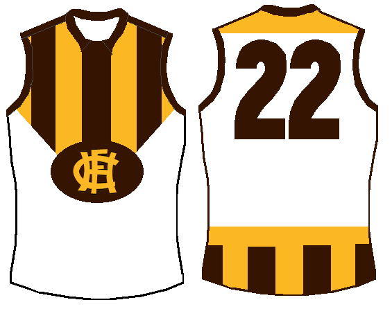
 Hawthorn Football Club – If any club is guilty of bringing the game into disrepute on account of poor uniform choice then it’s the Hawks. Firstly, working with ‘poos and wees’ isn’t easy, but the diamonds, the t-shirts, the camouflage, the intricate Hawks which no child has a chance of being able to quickly scribble in the back of the maths book, enough is enough! I decided, like Collingwood, to keep a part of the stripes and tie it together with the HFC monogram which was used on their heritage jumper a few years back, a fine jumper (brown with a gold V) which should be used from time to time as it far outweighs their current design.
Melbourne Football Club – As you can see, I like trying to keep as much of the original jumpers as possible. I toyed with a few things but couldn’t decide where the MFC monogram fitted best, so I’ve just added the two that looked best. I don’t hate Melbourne’s current clash jumper, but think it could do with a bit more blue.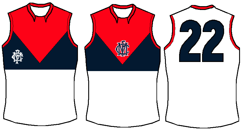
Ed- Thanks to twitter follower @MVZimmari pointing out that the Melbourne design looked like ‘some weird kind of bikini’ I have adjustted it and quite prefer it!
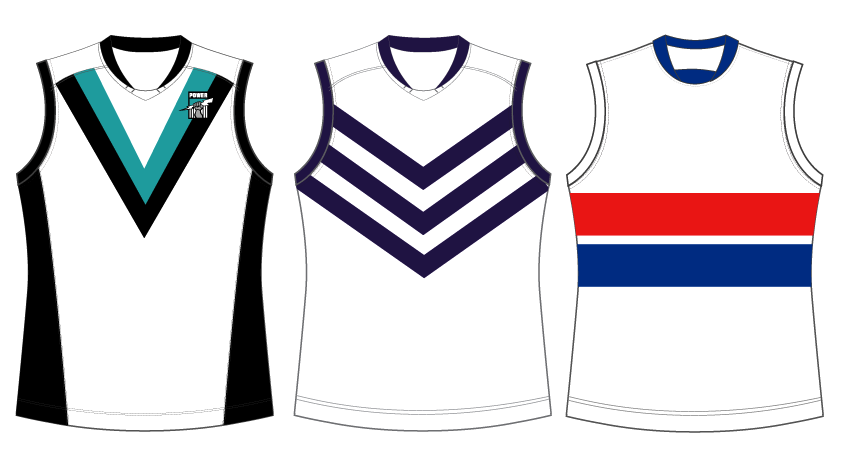
North Melbourne Football Club – I really like the white ‘V’ on blue which North wore as a heritage jumper a few years back, and it provides a great alternative to their light home jumpers whilst drawing from history. I think it’s actually quite bold when compared with their current jumper. A second option, and less preferred in my eyes, is similar to the Hawthorn and Collingwood designs.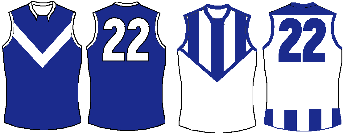 Port Adelaide Football Club – I actually love Port’s home and away jumpers, but the only change I’d make to the home jumper is to tie it to the past with this SANFL back and white trims. They’ll never get their prison bars but may as well look like the old SANFL magpies from behind. Nit-picking.
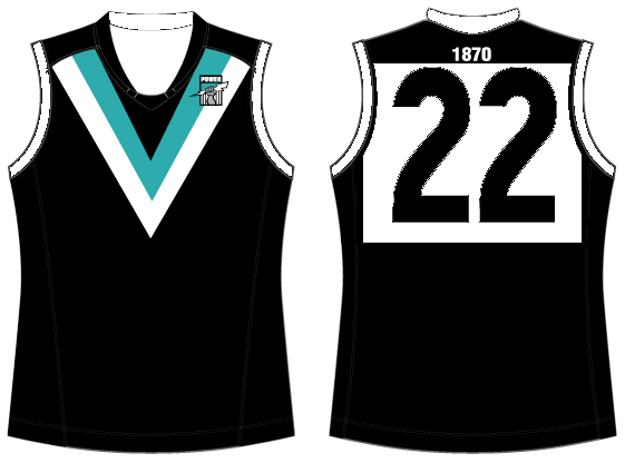 Richmond Football Club – Again, I’m actually quite fond of Richmond’s clash strip, but wonder how much it actually avoids the clash. I’m very much against reversing the yellow and black (sorry Richmond VFL!) and think the addition of white just adds to the ‘away white shorts’ idea. I prefer the jumper on the right, still very much a Richmond jumper but with white shorts, easily distinguishable against Essendon and Hawthorn…I think.
 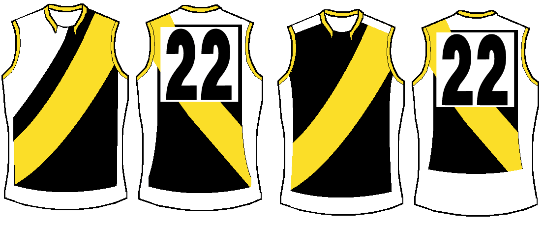 St.Kilda Football Club – The Saints have plenty of options when it comes to developing a clash jumper, but I have drawn on their 1997-era ‘crest’ jumper and have whitened it. But I’d be all in favour of stick man making his way onto the jumper also, and no, I’m not talking about Aaron Fiora!
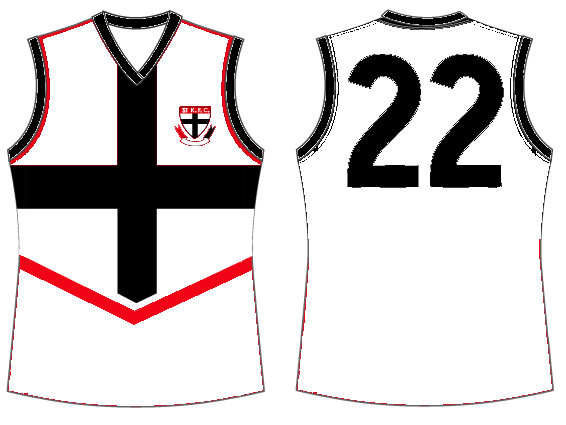 Sydney Football Club – What more can you say really? South Melbourne’s old jumper, and Sydney’s original jumper for what it’s worth. The biggest clash is with the Gold Coast so taking the biggest body of red away, the back, makes this mostly white, traditional jumper a no-brainer for mine. I toyed with losing the opera house off the home jumper, it is truly bizarre that there IS an opera house on any sporting guernsey the world over, but think this says a little bit about old Sydney town.
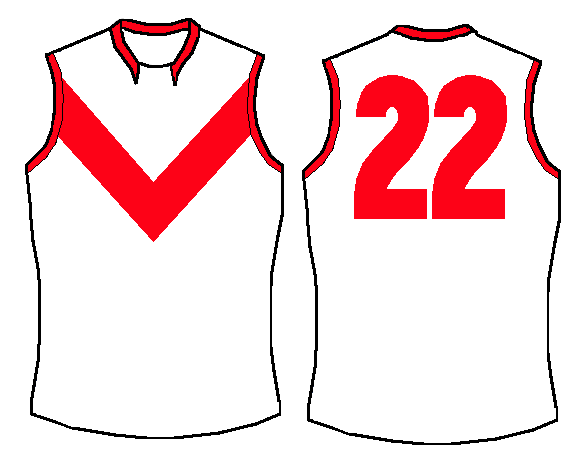 West Coast Football Club – Ah my old friends the Eagles. I’ve analysed the Eagles name, jumper and song HERE and I was far from favourable. I still feel as though they’ve never really settled on a jumper after all these years. Firstly, I’ve decided to remove all images. ENOUGH WITH THE IMAGES! WE GET IT, YOU’RE EAGLES! I also only realised recently that their current jumper, hiding behind a mean looking eagle Eagle, was actually a pretty stock-standard footy design. However I feel that the dark blue with the yellow and white is so uninspiring. Perhaps it reminded me of the two years I spent living in Doncaster, the bland Manningham city council logo everywhere.
Anyway, what I DO like about the Eagles jumpers is the royal blue they’ve often used. It has far more heart, and brings out the best in the yellow (I know, that sounds wanky but it’s true.) So to remake the West Coast home jumper, I have tossed aside the angular Eagle picture and changed the blue from navy to royal. One thing the Eagles have done well is to lose the white edging around their yellow numbers, a bug-bear of mine. Adelaide and Brisbane, TAKE NOTE!
So I looked at the jumper, and the thought hit me that the white was now diluting the blue and yellow, lets lose it. Now it may look a little like an old version of an East Fremantle jumper, but I’ve actually removed the Sharks white (which West Coast have in place) and replaced it with yellow. The reverse is the Eagles clash jumper, grown up versions of West Coast’s first two jumpers from 1987.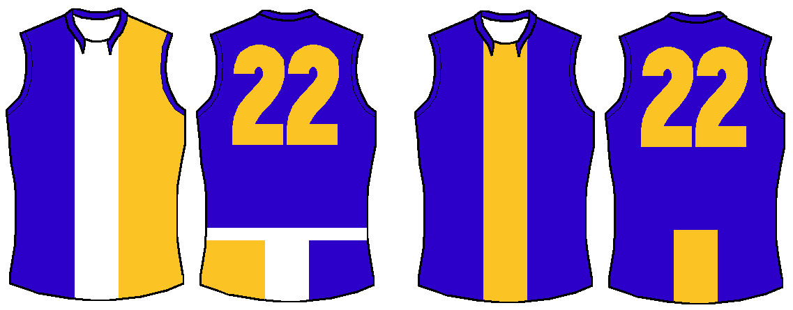

So there you have it. I would LOVE your feedback, and if you have any design ideas I’d love to see them too. And club land, stop employing professionals and designers to help with new clash designs. It’s money flushed down the toilet. There are any number of simple ideas here or on football forum sites which are fantastic, respect history, and provide a clash-free alternative. Alternatively, many primary school would be happy to run ‘jumper competitions!’
May the football gods be ever in your favour.
Boot